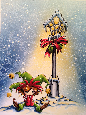
Coloring White Objects and Snow - Tutorial
Coloring Snow and White Objects
Some times when we imagine snow we think of
snow we imagine a fluffy, white covering. The fact is, if you look close enough you
will see more color than white. With
snow, the areas really are not white at all, but more a reflection of the
surroundings. Snow might have a tint of blue
that reflects the sky, or even gray if it’s an overcast day. In a nighttime scene you might have the moon
casting light, which could make the snow appear more of a darker shade of
blue. A lamp at night or the sunlight
during the day would cast a glow in more of warm tones. Light would tend to be
warmer and shadows are cooler in color.
Image by MakeItCrafty.com
Copics used on snow - B91 B95 B95 B97 YR31
When coloring snow objects you will want to
leave the majority of the image white and color in the more prominent shadows.
For cooler shadows you can use light blue
or purple colors for a cool crisp shadow or even cool gray. If there is a light reflecting a glow on the
snow then add some faint yellow.
Image by MakeItCrafty.com
Copic Snow colors – N1 N3 N5 BG10 with
color reflections
How to apply the ink to the object:
I like to think of the white as my lightest
color which covers the majority of the object.
I still use a dark and medium tone but the darkest marker is a light
shade allowing for a smooth blend into the white area using my medium
marker. When coloring the shadows within
a snow object I use light and heavy squiggly lines and blending them into the
white with the blender marker. This
makes the snow look fluffy. Sometimes I
moisten the paper with the blender marker, prior to adding the color, allowing
the color to blend into the white portion.
To finish it off you can add a little glitter to the snow or the Clear
Atyou Spica pen works nicely.
Image by Makeitcrafty.com
Copic - Sooty snow colors N1 N3 N5 N7 BG10
Coloring White Objects
This
same thing applies to coloring white objects. The slight difference would
be that an object that lives and breathes would have more warm tones such as
E40, E50, W1, vs. ones that are inanimate object would be cool to the touch so
would have the neutral tones within the N series of markers. If it were
an object that would be cool to the touch you would use cool tones such as the
lighter BG000, B000, BV20 and C1 just to name a few. Most of us color on
white card stock when coloring, so just remember to add slight color to the
shadowed areas of the actual object and color in the background as this will
leave the object looking more obviously white and give you the strongest white
results.
Color the Background (airbrushed, blender pen for clouds)
Add in color in the shadowed areas
We can see that coloring white and coloring snow are both
similar. They do not need to be time consuming. Just pick your colors and place them in the
shadow areas. Use your best judgment on
light placement. Remember to have fun…it
is only ink and paper.
Jennifer Dove
Http://just4funcrafts.blogspot.com
Intermediate Copic Certified designer
Published in Copic Color Guide 2 and 3
Author of Build-a-Book Technique guide (for my Copic
retreats)
Published instructional video through Anniesonline.com
classes

.jpg)


Comments
Thanks 😉